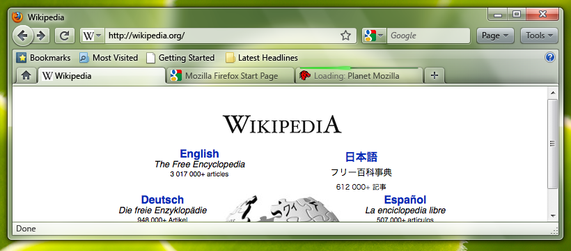
I find it interesting that people complained bitterly about the Office 2007 Ribbon, especially how it was so vastly different to the UI of Office 2003. What is to stop this same reaction to the new Firefox UI? Mozilla is making the right move in the gradual UI change over 2 versions, one minor and the other major. This won't isolate their users and users will have plenty of time to get accustomed to the UI. However new users may beturned away by an unfamiliar interface which can only be overcome by a tutorial to teh new UI...WHICH IS NOT ON THE PLANS!!!! Mozilla will need a tutorial video on the new UI if anyone is going to be able to use it as people are very stupid and do not like change unless they know that they will be able to handle it.
Another idea put forward is App Tabs which would be tabs that you would have open all the time, like GMail or Facebook, and could access all the time without the clutter of the bac/forward buttons, freeign up space making it more user friendly for the site you wnat to view. This is a brilliant idea which Mozilla started planning with Prism, and now to carry it into Firefox itself...genius. In GMail I do not want to have the Back/Forward/Stop/Refresh buttons as they just take up space and are useless. People will catch on to this very quickly and I expect it to be one of the more popular changes.
Personally I think that Firefox is due for a major UI update and the plans put forward are great but Mozilla should be catious with making radical changes and should definately listen to their users about what they want. The changes make it sort of CHrome like, which is good, and the tab bar will be moved to the top (in FF4) and a progress bar will be added above the tabs. This will free up clutter and make Firefox a very sexy browser.
Firefox 3.7 Planned UI
Firefox 4 Planned UI


No comments:
Post a Comment